Pages

Wednesday, December 12, 2018

A Risk Sharing View of Monetary Policy

I have a new working paper titled "Better Risk Sharing Through Monetary Policy? The Financial Stability Case for a Nominal GDP Target". I presented this paper at the recent Cato Monetary Policy Conference. Here is the abstract:
A series of papers have shown that a monetary regime targeting nominal GDP (NGDP)
can reproduce the distribution of risk that would exist if there were widespread use of state contingentdebt securities (Koenig, 2013; Sheedy, 2014; Azariadis et al., 2016, Bullard and DiCecia, 2018). This paper empirically evaluates this view by exploiting an implication of the theory: those countries whose NGDP stayed closest to its expected pre-crisis growth path during the crisis should have experienced the least financial instability. This paper constructs an NGDP gap measure for 21 advanced economies that is used to test this implication. The results strongly suggest that there is a meaningful role for NGDP in promoting financial and economic stability.
And an excerpt:
The key insight of Koenig (2013), Sheedy (2014), Azariadis et al. (2016), and Bullard and DiCecia (2018) is that in a world of incomplete markets where there is non-state contingent nominal contracting, an NGDP target can reproduce the risk distribution that would occur if there were complete markets and state contingent nominal debt contracting. An NGDP target, in other words, can make up for the lack of insurance against future risks that could affect debtors’ ability to repay their debt. Conversely, an NGDP target can also make up for the lack of insurance against potential returns a creditor might miss out on because their funds are locked up in a fixed-price nominal loan. Bullard and Dicecia (2018) show that this result holds even when the heterogeneity among debtors and creditors modeled approximates that of the actual income, financial wealth, and consumption inequality in the United States. They note this makes NGDP targeting “monetary policy for the masses.” 
This paper uses what I call a 'sticky-forecast' of NGDP as a benchmark path. Here is the intuition for the measure:
The idea behind the sticky forecast path for NGDP is twofold. First, the public makes many economic decisions based on a forecast of their nominal incomes. For example, households may take out a 30-year mortgage based on an implicit forecast of their nominal income over this horizon. The actual realization of nominal income may turn out to be very different than expected, but the households may not be able to quickly adjust their plans given sticky debt contracts and other commitments that constrain them. Therefore, the consequences of previous forecasts are often binding on them and slow to change even if their nominal income forecasts have been updated. Second, in addition to these old forecasts and decisions whose influence lingers, new forecasts and new decisions are being made each quarter for subsequent periods that will also have lingering effects. Together, this means future periods have many overlapping and different forecast applied to them that only gradually adjust.
The sticky-forecast path of NGDP can be viewed, in other words, as the neutral level of NGDP given the public's expectations of nominal income leading up to each period. The gap between it and actual NGDP is the "NGDP gap" and provides a measure of the stance of monetary policy.

Here is a note that further explains its construction for the United States using quarterly data from the Survey of Professional Forecasters. The note also shows how the sticky-forecast measure can be used as cross-check on the stance of U.S. monetary policy. The figures below illustrate its use. The first figure shows the sticky-forecast path of NGDP along with the actual NGDP series.


This next figure show the NGDP Gap, the percent deviation between these two series. As noted above, this can seen as the stance of monetary policy. Interestingly, it provides results very similar to Taylor rules. The NGDP Gap indicates that currently the monetary conditions are still a bit tight, but close to neutral. 


How Close is the Fed to a Corridor System?

I recently participated in an AEI event that showcased George Selgin's new book on the Fed's floor  system. My role at the event was to comment, along with Bill Nelson, on George's book. 

Readers of this blog will know I share many of George's concerns about the floor system that are outlined in his book and I would like to see the Fed move to a symmetric corridor system. The FOMC spent a good portion of its November meeting discussing this issue. My comments at the AEI event, however, were not on the tradeoffs between a corridor and floor system but rather on how close the Fed currently is to a corridor system. There are some indicators that the Fed may not be too far away.

To illustrate my point, consider the figures below. The question I considered is how far the Fed is from transitioning from the figure on the left below to the one on the right. Note, that there are two ways to make this move. First, the supply of reserves (red line) can shift back until it hits the slopping part of the reserve demand curve. Second, the demand for reserves (blue line) can shift out until the slopping part of the demand hits the reserve supply schedule. Or, there can be some combination of both developments. In either case, reserves become relatively scarce, unsecured interbank lending revives, and reserves once again will bear an opportunity costs. 


In my remarks I noted that there have been both supply and demand shifts that have moved the Fed closer to a corridor system.  (For more details on this simple supply-demand model see my recent paper.)

On the supply side, there has been a reduction in reserves going on since August 2014. Initially, the decline was largely due to the the growth of the Treasury General Account (TGA) and overnight reverse repos displacing reserves. Since October 2017 it also been the result of the Fed decreasing reinvestment of principal payments on its asset holdings. Collectively, these actions have led to a decline of about $1 trillion dollars in reserves over the past four years. Reserves are now just over $1.7 trillion. This can be seen in the figure below:


On the demand side, there have been new regulations and apparently a general rise in risk aversion that has led to a higher demand for reserves than existed before 2008. The main regulatory development is the liquidity coverage ratio (LCR) which requires banks to hold enough liquid assets to cover 30 days of withdrawals. The LCR treats bank reserves and treasuries as the top "high quality liquid assets" (HQLA) in meeting this requirement. 

For most of the past decade, the IOER rate has been higher than that yield on overnight treasury repo rates creating an elevated demand for reserves to meet the HQLA. As seen below, however, this relationship has changed with measures of treasury repo rates bouncing around--and increasingly above--the IOER rate. As I have explained elsewhere, this is largely due to President Trump's budget deficits sharply increasing the supply of treasury bills.


This reversal in relationship should mean, all else equal, that that banks will be indifferent between holding bank reserves and treasury bills. However, the most recent Senior Financial Officer Survey indicates that even in this "constellation" of interest rates banks still want to hold a lot of reserves relative to the pre-crisis levels. Specifically, the banks indicate they would want to hold $617 billion in reserve balances. Now the survey only covers banks that currently hold two-thirds of bank reserves. Consequently, extrapolating this number out another third puts the total desired reserve balances at $927 billion. This implies a large rightward shift of the reserve demand curve compared to pre-crisis demand for reserves. 

Given these developments, if the Fed continues to reduce its balance sheet by $50 billion a month then it should reach a point of reserve scarcity (i.e. $927 billion) by early-to-mid 2020. This can be seen in the figure below.


Put differently, the Fed could be back in a corridor system as early as 2020 if it were to put its balance sheet reduction on autopilot. Note that balance sheet would be permanently larger--even after accounting for currency or NGDP growth--at a size near $3 trillion. 

Interestingly, the Senior Financial Officer Survey also indicates that if the Fed really wanted to shrink the supply of reserves to levels comparable to the pre-crisis system there is a way. All that is needed is for the price to be right. 

Specifically, the survey asked the banks whether they would decrease their reserve holdings further if comparable short-term interest rates were to rise above IOER by 5, 25, and 50 basis points (bps). The percent of banks that answered yes were 8, 46, and 49 percent, respectively. So somewhere between 5 and 25 bps, there is a threshold were a large number of banks would find it worthwhile to depart with reserves and hold treasury bills. Everyone has a price.1 Obviously, in this case the time to a corridor system would take longer as the reserve demand curve will have shifted inward.

The big takeaway, for me, is that the Fed may not be that too far away from a corridor system that maintains a moderately-sized balance sheet (owing to the residual demand for bank reserves). For reasons outlined in my previous post, however, I would prefer a return to a corridor system with fewer reserves and the Senior Financial Officer Survey suggests this outcome is possible.

P.S. Bill Nelson of the Bank Policy Institute had some really interesting comments at the event.

1 What is really interesting about this finding is that Dutkowsky and VanHoose (2018) find in a theoretical model that banks would stop holding large amounts of excess reserves once the spread crossed 6 bps. This theoretical results fits nicely with the survey showing their is a threshold between 5 and 25 bps.

Tuesday, November 27, 2018

A New Paper on the Fed's Floor System

As readers of this blog know, I have an interest in the Fed's operating system. This interest has culminated in a new paper where I look at the consequences of the Fed moving from a corridor system to a floor system in 2008. In particular, the paper looks at what this change has meant for bank portfolios and, as a result, financial intermediation provided by banks. The paper concludes with some policy recommendations. I would also note that George Selgin has just released a new book on this topic. My hope is that these projects will help inform the conversation over what operating system the Fed wants as it continues to normalize monetary policy. 

Paper Outline
So what does my paper have to say? It starts by laying out the standard arguments for a floor system:
The central idea behind this move was to remove the opportunity cost to banks of holding excess reserves by offering the banks a deposit rate at the Fed—the IOER rate—that was equal to or above short-term market interest rates. This favorable return was to sever banks’ incentive to rebalance their portfolios away from excess reserves toward other assets. The IOER rate was also to put a floor under short-term interest rates so as to align them with the Fed’s desired interest rate target. Together, these two facets of the floor system would allow the Fed to use its balance sheet as a tool of monetary policy while still maintaining interest rate control. 
In this new operating system, the stance of monetary policy was no longer set by a market interest rate but by an administrative interest rate: the IOER rate. The stance of monetary policy also was no longer tied to the supply of reserves. Instead, it was linked to the quantity of reserves demanded by banks, which the Fed influenced through changes to IOER. Specifically, the Fed set the IOER rate high enough that banks’ demand for reserves became perfectly elastic with respect to the federal funds rate. As a result, changes in the quantity of reserves supplied led to identical changes in the quantity demanded, other things being equal.  
The Federal Reserve, in short, went from an operating system in which monetary policy was transmitted through open market operations to one in which it is transmitted through the IOER rate. The Fed’s operating system changed from one in which money, in the form of reserves, mattered for monetary policy to one in which money has been “divorced” from monetary policy.
Okay, so why does this "divorce" matter? For advocates of a floor system the answer is simple:
This divorce from money is seen by many observers as the key advantage... because it gives the Fed the freedom to use its balance sheet independently of its desired interest rate target. The Fed, for example, can now sharply increase the supply of reserves in response to a liquidity crisis without causing a decline in its targeted interest rate.
Skeptics of the floor system, on the other hand, see this divorce as more problematic:
Others, however, see this divorce as creating an operating system that impairs the transmission mechanism of monetary policy... These observers’ understanding starts with the standard assumptions of a floor system. First, a floor system requires the IOER rate to be set at least equal to short-term interest rates. This removes the opportunity costs to banks of holding reserves and thereby keeps their demand perfectly elastic with respect to other short-term interest rates...  
[This] can lead to a rebalancing of bank portfolios that causes the supply of loans to be lower than it would have been otherwise. Banks lend as long as the marginal cost of funding is less than the risk-free marginal return on bank lending. In the Fed’s floor system, the IOER rate sets the marginal funding cost. Consequently, by setting the IOER rate higher than other short-term interest rates, the Fed has raised the marginal costs of funding and narrowed the gap between these costs and the risk-free marginal return on bank lending. All else being equal, the narrowing of this gap implies a relative reduction in the supply of loans and therefore a relative decline in the money supply.
Are these worries merited? My paper provides an empirical look at bank portfolios before and after the advent of the floor system to see if (1) there have been big structural shifts in bank balance sheets consistent with the critics claims and (2) whether such shifts can be attributed to the Fed's floor system. 

Empirical Evidence
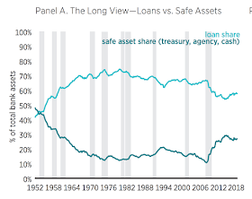
On (1) I start with the following figure. It shows the share of bank assets allocated to loans and to safe assets (defined as the sum of cash, treasury, and agency asset holdings). Unsurprisingly, these series are almost mirror images of each other over both cyclical and structural time horizons. They tend to move in opposite directions during recessions--the grey bars--and over longer periods. At the advent of the floor system in late 2008, the loan share began declining as the safe asset share started rising. This change has been sustained and only recently has started reversing: 


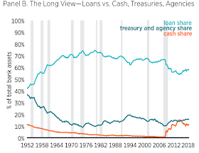
If we break the safe assets apart into its subcategories, we see that that this tight link has been historically driven by movements in treasury and agency investments corresponding with changes in the loan share. Since 2008, the driving force behind the tight link became cash not treasury and agency investments:


If we zoom in and use two scales, this apparent structural change is even clearer.  Cash shares and loan shares become mirror images of each other:


Something big happened in 2008 that continues to the present that caused banks to allocate more of their portfolios to cash assets and less to loans. While the financial crisis surely was a part of the initial rebalancing, it is hard to attribute what appears to be 10-year structural change to the crisis alone. Instead, it seems more consistent with the critics view that the floor system itself has fundamentally changed bank portfolios allocation.

That takes us to question (2). The following figure shows the loan share of bank assets plotted against the spread between the IOER rate and the overnight dollar Libor rate. This IOER-Libor spread is negatively and strongly correlated with the loan share. This suggests banks invested less in loans when the relative return on bank reserves rose and vice versa.


Conversely, banks appear to have allocated more to cash assets with the IOER-Libor spread rose and vice versa:


The paper goes on to more carefully test these relationships using two-stage least squares regressions that control for endogeneity issues and other confounding influences. Moreover, the paper also provides a further breakdown of this relationship among foreign banks, large domestic banks, and small domestic banks. Collectively, the regressions point to a strong causal effect running from the IOER-Libor spread to the allocation of bank assets.

The Fed's move to a floor system, then, does seem to have influenced the amount of financial intermediation provided by banks to the private sector. The end of the paper provides some counterfactual exercises, including the following figure


This counterfactual shows the supply of bank loans would have been, at its peak, as much as $2 trillion higher in 2014. By mid-2018, with the IOER-Libor spread shrinking, it was closer to a $1 trillion shortfall. Now to be fair, other factors such as increased risk aversion, fintech, and new regulations also contributed to below trend growth in bank lending since the crisis. Still the evidence strongly suggest that financial intermediation to the private sector through banks declined because of the floor system. 

Policy Implications
The Fed's floor system, in short, has caused banks to increase their investment in the Fed at the expense of investing in the private sector. The question, then, becomes whether the Fed is any better than banks in allocating this credit. Put differently, is the Fed as a financial intermediary--funding short and lending long--really providing a better financial service than would have been provided by the private sector financial firms? It is not obvious to me that the answer is yes. 

What is obvious to me is that the Fed's floor system creates a whole set of other problems. First, as a profitable financial intermediary, the Fed is setting itself up for political shenanigans. Recall Congress taping into the Fed's capital surplus in 2018 and 2015. Though these transfers were relatively small and to some extent accounting gimmicks, they show how tempting a large, profitable Fed balance sheet can be to Congress. Second, the floor system effectively destroyed unsecured interbank lending. This market provided useful interbank monitoring and price discovery that no longer exists. Bringing this market-based monitoring back would be a nice addition to the bank regulator's existing toolbox. Third, the floor system forces the Fed to take safe asset collateral off the market which impairs other parts of the financial system. Only recently has President Trump's budget deficits begun to fill this hole. Fourth, the floor system can create bad optics for the Fed via the appearance of large 'subsidies' to large and foreign banks. In this era of populist politics, the Fed should be worried about the dangers to its independence this image could create. Finally, as noted above, I worry the Fed is a less effective financial intermediary than the private sector.

In short,  I see the costs exceeding any benefits from the floor system. That is why I advocate a return to a corridor system, but this time with the IOER explicitly setting the lower boundary. That is, the IOER would still be around, but it would be set lower than overnight market interest rates. For the past decade it has been for the most part above them. More details are in the paper.

Update: I have had several commentators ask me about the difficulty of returning to a corridor system given the relatively new LCR. Let me quote Governor Randy Quarles from a recent speech:
How banks respond to the Fed's reduction in reserve balances could, in theory, take a few different forms. One could envision that as the Fed reduces its securities holdings, a large share of which consists of Treasury securities, banks would easily replace any reduction in reserve balances with Treasury holdings, thereby keeping their LCRs roughly unchanged. According to this line of thought, because central bank reserve balances and Treasury securities are treated identically by the LCR, banks should be largely indifferent to holding either asset to meet the regulation. In that case, the reduction in reserves and corresponding increase in Treasury holdings might occur with relatively little adjustment in their relative rates of return.
In other words, since reserves and treasuries are viewed as equal HQLA there could be a substitution between the two as the Fed shrinks its balance sheet down. Quarles notes that currently some banks favor reserves, but that tells us nothing about what is ideal or what would transpire in a new symmetric corridor system. Finally, it is also worth noting that  banks can use Treasuries, but not reserves, as collateral for repos. Manhoman Singh is very good on that point. So Treasuries can actually make banks more liquid that non-hypothecatable reserves.

P.S. Here is a panel from the recent Cato Monetary Policy Conference on this issue. Great comments from Stephen Williamson, George Selgin, and Peter Ireland. Josh Zumbrum was the moderator.

Monday, November 26, 2018

Janet Yellen on NGDPLT

Andrew Metrick of Yale University interviewed former Fed Chair Janet Yellen today. It was an interesting discussion and one where they talked about, among other things, what changes the Fed could bring about in light of the recently announced strategies, tools, and communication review to be held in 2019.  Janet Yellen said her idea for reform "has much in common with NGDP targeting". Her response can be seen in the video below:


Glad to see her endorse a NGDPLT-like monetary regime. 

Tuesday, October 2, 2018

"Et tu, John Williams?"


Tim Duy reports that r-star, which rose to prominence over the past few years, is experiencing a Caesar-like betrayal at the Fed:
The Federal Reserve’s “r-star” has gone full supernova. New York Federal Reserve President John Williams, its key proponent, made clear in a speech late Friday that the neutral interest rate is no longer a guiding star for monetary policy. This means a federal funds rate in the range of what is considered neutral has no special significance as far as policy is concerned... 
Williams’s attachment to r-star cannot be overstated. At a professional level, it has been a key element of his research agenda. As recently as May he said that for “the moment, r-star continues to shine brightly, guiding monetary policy, but hold steady, low on the horizon.” The moment quickly passed. Last week, he tossed aside the metric, saying that it has “gotten too much attention in commentary about Fed policy.” A remarkable shift after just two 25-basis-point rate increases since his May comments... 
Williams’ speech marks the end of a transition in policy away from explicit forward guidance. It began this past August with Fed Chairman Jerome Powell’s Jackson Hole speech in which he noted the uncertainty surrounding estimates of key variables like the neutral interest rate. Fed Governor Lael Brainard pushed this point further in a subsequent speech, adding further uncertainty by differentiating between short- and long-run neutral. It continued in the September Federal Open Market Committee statement with the removal the description of policy as “accommodative.” And it ends with the primary proponent of the r-star concept — Williams — throwing it into the trash bin of crisis-era policy artifacts.
One is tempted to say "It was good knowing you r-star". However, r-star will still be around in all the models used by the FOMC and Fed staff. Just look at, for example, the policy rules on the Board of Governor's website or in its annual report. The reported change, as I see it, is more a move toward less explicit reliance on it. Implicitly, r-star will still be important to an FOMC that relies on the Phillips curve thinking in making its decisions. 

Still, these developments do indicate there is some movement towards looking at other indicators as I noted in recent post. There I suggested one useful metric the FOMC could add to its lists of monetary policy indicators is the gap between a stable benchmark growth path for nominal GDP and its actual value. I outlined in this note several ways to create this metric and note that it is in the spirit of a NGDP level target without actually adopting one. 

There are many reasons for the Fed to start following the NGDP gap. The most practical one is its ability to help the FOMC avoid falling for the inflation head fakes created by supply shocks. Here is hoping that out of the ashes of r-star's apparent demise arises an increased desire by the FOMC to pay attention to the NGDP gap.

Friday, September 21, 2018

FOMC Preview: "We Have the Nerve to Invert the Curve"

The quote in the title should be the motto for the 2018-2019 FOMC. For the FOMC is set to raise its interest rate target next week and expected to raise it several times more in 2019 despite a flattening treasury yield curve.


As seen in the above chart, the outright inversion of the treasury yield typically leads to a recession.  Despite this robust pattern, a growing number of Fed officials have become emboldened in their dismissal of it "since this time is different."  As Caroline Baum notes, 
In April, John Williams acknowledged that an inverted yield curve is “a powerful signal of recessions,” based on a significant body of research, including that by staff economists at his former bank. 
By September, Williams was already disavowing that signal. “I don’t see the flat yield curve or inverted yield curve as being the deciding factor in terms of where we should go with policy,” Williams said following a speech in Buffalo on Sept. 6. 
Next up was Fed Gov. Lael Brainard. She broke new ground in a speech last week when she... invoked the four most dangerous words in finance — “this time is different” — and applied them to the prospect of an inverted yield curve.
To be fair, President John Williams and Governor Lael Brainard are simply expressing the natural implications of the FOMC projected path for interest rates. As I noted before, the FOMC's own summary of economic projections implies a yield curve inversion over the next year or so. The FOMC, in short, is becoming increasingly dismissive of fears about inverting the yield curve. That is why the title of this post should be their motto for 2018-2019. Here is a t-shirt you can buy to commemorate this surge in FOMC boldness:


Some observers side with Fed officials arguing that "this time is indeed different" because the term premium is so low. To that I would first remind them that former Fed chair Ben Bernanke made a similar argument in 2006. As it turned out, the term premium had declined but so had the expected path of short-term interest rates. This can be seen in the figure below, which is constructed using the New York Fed's estimates of term premiums. It shows the 10-year minus 1-year treasury spread decomposed into (1) an expected rate path spread and (2) a term premium spread. These two component add up to the overall spread. The lesson here for the FOMC is to avoid falling for the siren call of the term premium excuse.


I would also remind naysayers that even if it were the case that the flattening of the yield curve is all due to a lowering of the term premium, the inverting of the yield curve still matters for financial intermediation. An inverted yield curve means smaller net interest margins for financial firms and thus less financial intermediation. That is, once the yield curve inverts, it goes from being a predictive tool to a causal agent. So even in the best-case scenario, one should not be cavalier about inverting the yield curve. Be careful FOMC.

P.S. Here is the backside of the t-shirt:


Monday, September 17, 2018

More Non-Star Metrics for Monetary Policy

In an earlier post and Bridge article, I discussed some ways to use nominal GDP (NGDP) as a cross-check on the FOMC "navigating  by stars" of r*, u*, and y*. The  motivation for these pieces was Fed Chair Jay Powell's concerns about the challenge of using these star variables when they seem increasingly in flux. Here, again, is a key excerpt from his talk:
Navigating by the stars can sound straightforward. Guiding policy by the stars in practice, however, has been quite challenging of late because our best assessments of the location of the stars have been changing significantly… the FOMC has been navigating between the shoals of overheating and premature tightening with only a hazy view of what seem to be shifting navigational guides.
The Fed chair is implicitly challenging us to find indicators that shed light on the stance of monetary policy without having to know r*, u*, and y*. The metric I suggested in the earlier pieces was the "sticky-forecast" NGDP benchmark growth path. Here I want to suggest another two measures for the Fed chair.

First, is a Phillips curve-like measure. I am not a fan of Phillips curves, but they remain stubbornly popular among policymakers and the public. They are supposed to show a relationship between the amount of slack in the economy and wage growth. However, most Phillips curves have not done well predicting wage growth (or inflation) over the past few years. Although there are many ways to measure slack in a Phillips curve, typically it is done using the unemployment rate. Attempts to salvage the Phillips curve using other slack measures have been made, like that from Adam OzimekErnie Tedeschi, and Nick Bunker who argue we should use the prime-age employment-to-population (EPOP) rate. Jason Furman, however, pushes back against this and other attempts to better define slack.

If we must stick with Phillips curve to explain wage growth as the FOMC seems intent on doing, here is my suggested approach. Take the spread between the U6 and U3 unemployment rates. This measure, unlike the prime-age EPOP, is stationary and therefore not subject to the Furman critique. Unfortunately, the U6 only goes back to 1994 so not a lot of historical analysis is possible with it. Since that time, the U6-U3 gap seems to be a fairly reliable predictor of wage growth.  The figure below plots this relationship. For purposes of comparison, it also highlights the late 1990s (blue) and the more recent years of the wage growth mystery (red).


One interpretation of this figure is that even though the U3 unemployment rate is currently low and below u*, the economy is not running as hot as it was it was in the late 1990s when the U6-U3 spread was even lower than it is now. This complements the message coming from prime-age EOP Phillips curves. This would call, all else equal, for fewer rate hikes rather than more from the Fed.

Okay, enough of Phillips curve. I want to move on to another related indicator, one that does not rely on a measure of slack but is instead tied to monetary conditions. And that is another application of my 'sticky forecast' NGDP gap measure, as explained in this note. NGDP is tied to monetary conditions for several reasons. First, it measures total money spending on the final goods and services produced in the economy. Second, it is equivalent to the velocity-adjusted money supply. NGDP, therefore, is an easy way to get a bird's-eye view of money activity in an economy. 

My sticky-forecast benchmark growth measure of NGDP can be subtracted from actual NGDP to get a NGDP gap measure. I replace the U6-U3 spread in the above figure with this NGDP gap measure to get the new scatterplot below. Once again, the late 1990s and more recent years are highlighted for purposes of comparison. And, once again, it suggests that the economy is running cooler now than in the late 1990s. Most importantly, it shows there is a strong relationship between monetary conditions and the nominal wage growth rate. Money still matters. 


Friday, September 14, 2018

The Fed's Floor System: Sayonara?

Are the days of the Fed's floor system numbered? Last month I claimed that they could be if President Trump's fiscal policy continues to spawn rapid increases in the issuance of treasury bills. His administration is relying heavily on treasury bills to finance its deficits as seen below:


This increased issuance of treasury bills matters because it implies, all else equal, a rise in treasury bill yields. Below is a figure showing the  DTCC overnight treasury-repo rate relative to the IOER rate. Lately, the treasury-repo rate has been bouncing above the interest on excess reserves (IOER) rate. This development could be a big deal.


If sustained, this rise of overnight interest rates above the IOER rate could spell the end of the Fed's floor system. 

To see why, recall that the Fed moved to a floor operating system in late 2008 by paying interest on excess reserves (IOER) at a rate higher than comparable short-term market interest rates. This pushed banks onto the perfectly elastic region of their reserve demand curve and allowed the Fed to add reserves to the banking system without causing its target interest rate to change. The supply of reserves were thus "divorced" from the setting of monetary policy (Keister et al. 2008). This divorce was seen by many a virtue of the floor system, for it allowed the Fed to manage bank liquidity and monetary policy independently, changing the size of its balance sheet to control liquidity, and the IOER rate to alter its monetary policy stance.

Maintaining this floor system, therefore, requires keeping the IOER rate at or above comparable market interest rates, so that banks will be willing to hold on to any reserves that come their way. The recent uptick in treasury bill issuance seems to be undermining this requirement and raises the possibility that the Fed could be inadvertently forced off of the floor system by fiscal policy. 

Further evidence that something may already be afoot with the rise in the overnight repo rates can be seen on the aggregate bank balance sheets from the Fed's H8 database. The figure below shows the asset category "total fed funds sold and reverse repos" as the black line. The blue line shows the same category, but just for banks transacting with other banks. This figure indicates there still is not much interbank lending, but there does appear to be a surge in nonbank lending in repos. This makes sense given the recent surge in repo rates. It may also be the first crack in the armor of the Fed's floor system as it suggest banks are beginning to invest reserves in the repo market rather than at the Fed.


Something else I showed in my piece last month was the tight fit between treasury bill issuance (normalized by the total amount of marketable treasury securities) and the IOER-Libor spread. One interpretation of this relationship is that the movement of treasury repo rates gets transmitted into interbank rates via arbitrage. 


This IOER-Libor spread, in turn, is closely tied to the percent of bank assets held in the "cash" category in the H8. (Since late 2008, this category has consisted mostly of bank reserves.) The specific pattern has been that as the IOER spread rises (falls) the cash share also rises (falls) as seen below:


Conversely, when the that as the IOER spread rises (falls) the loan share of bank assets falls (rises) as seen below:


Based on the three above charts, if the treasury-repo yield continues to be above the IOER, we should expect to see a growing share of bank assets invested in loans and fewer in excess reserves.1 That would bring the end of the Fed's floor system and rise in the inflation rate.

Some worry the liquidity coverage ratio (LCR) may complicate this story. As of 2015, the LCR started requiring banks to hold enough high-quality liquid assets to withstand 30 days of cash outflow. The LCR, consequently, has increased demand for such assets of which bank reserves and treasury securities are considered the top tier. When the IOER rate > treasury repo rates, the LCR created additional demand for reservers relative to treasuries. If, however, IOER rate <  treasury repo rates the additional reserve demand will disappear and further hasten the demise of the floor system. 

The question, then, is will the treasury bill yields continue to stay above the IOER rate? It certainly seems possible with President Trumps budget deficits. Only time will tell. 

P.S. I have a working paper on the Fed's floor system. I am beginning to wonder if it will be outdated before it gets published.

P.P.S. I see that George Selgin makes the same point near the end of this post.

1To be clear, banks cannot control total reserves, but they can control the form of the reserves. That is, banks can choose to hold excess reserves or invest in other assets like treasuries and loans that, in the aggregate, would lead to a rise in required reserves and a fall in excess reserves.

Update: One implicit assumption in my analysis is that banks are price takers, not price makers, in the overnight market. If one takes the H8 data series "fed funds sold and reverse repos" and divides it by the repo market as calculated by this New York Fed study (and updated to a more current expansion factor based on an exchange with one of the authors), one gets an average of 10 percent for the 2008:Q4-2018:Q2. Banks have been a small part of the overnight market during the Fed's floor system.

Update II: After more reflection, I am having doubts about my assumption of banks being price takers in the overnight market. I think my calculations of bank share of the repo market supports this contention, but it is hard to reconcile with the reality that overnight market rates followed movements in the IOER rate. On the other hand, if banks are able to move overnight markets then why did they fail to completely eliminate the IOER spread over comparable short-term interest for most of the past decade? 

Navigating by the Stars and Steadying the Ship Speed

I have a new article over at The Bridge where I piggyback off of Jay Powell's recent speech about the challenges of the Fed 'navigating' by the stars of  r*, u*, and y*. His concern is how to use them when they seem to be moving a lot:
Navigating by the stars can sound straightforward. Guiding policy by the stars in practice, however, has been quite challenging of late because our best assessments of the location of the stars have been changing significantly… the FOMC has been navigating between the shoals of overheating and premature tightening with only a hazy view of what seem to be shifting navigational guides.
Here is a chart I made for the piece that did not make the final cut. It shows the changing range of FOMC estimates for u* and the actual unemployment rate (u). I also added some red-lettered commentary on the chart to highlight the varying levels of FOMC concern about the gap between u and u*:


Okay, so what is the FOMC to do with all the uncertainty surrounding the navigating stars? I recommend in the article that the Fed cross check their navigational indicators by looking at nominal GDP (NGDP) relative to a benchmark growth path for it.  This growth path can roughly be thought of as the neutral level of NGDP and I show how to construct two versions of it in a recent note: a sticky forecast NGDP level and a full-employment NGDP level as seen below:


Taking percent deviations of these growth paths from the actual NGDP level gives us the following Nominal GDP gaps:


Going back to Fed Chair Powell's ship navigation analogy, looking at the NGDP gap is akin to monitoring the speed of the ship. If the NGDP gap is zero, then the ship is maintaining a steady and appropriate speed. According to the chart above, the ship is either a bit too slow per the sticky forecast measure or just about right with the full-employment measure. My preferred measure is the sticky forecast NGDP gap, so if I were Chair Powell I would currently err on the side of fewer rate hikes than more.

The main point of my note is to show how one can use NGDP as a practical way to cross check standard monetary policy indicators. I provide some other measures in the note such as a NGDP-based Taylor rule that does not rely on any of the navigational stars. I also show how a McCallum rule (which also is based on NGDP) can still be used if the monetary base is properly measured. 

Wednesday, July 25, 2018

Closer to OCA Criteria: Eurozone or Dollarzone?

This is a quick follow-up to my recent article on the Eurozone. There I argued for more integration or separation in the Eurozone since ECB monetary policy is pushing regional economies further apart rather than together. I showed a version of the below chart in the article to illustrate this point:


ECB policy--and its response to the various shocks hitting the Eurozone--has effectively kept nominal demand growth in the core economies fairly stable while pulling it down in the periphery. This divergence suggest the Eurozone is quite far from being an optimal currency area (OCA). 

Someone asked on twitter what the chart would look like for the United States. So I made a similar chart that compares the top twenty states (ranked in terms of GDP per capita) to the bottom twenty:


While both regions are below their pre-crisis trend paths, Fed policy has at least been consistent in how it has affected nominal income growth in both rich and poor states. So the Fed beats the ECB on consistency, at least! 

Moreover, this outcome suggests there are more effective regional shocks absorbers in the United States that make the dollar zone more of an OCA than the Eurozone. That is, even if Fed policy is not optimal for all regions of the United States this is less of a problem than in Europe because the regions can better handle bad monetary policy via fiscal transfers, labor mobility, safer retail banking system, flexible prices, etc. For more on these shock absorbers see my other recent post on this topic.

Will Australia Be the First Country to Try NGDPLT?

There is a new Brookings paper by Warwick J. McKibbin and Augustus J. Panton titled Twenty-five Years of InflationTargeting in Australia: Are There Better Alternatives for the Next 25Years? Here is how they answer the question in their title:
This paper surveys alternative monetary frameworks and evaluates whether the current inflation targeting framework followed by the RBA for the past 25 years is likely to be the most appropriate framework for the next 25 years. While flexible inflation targeting has appeared to work well in Australia in the past decades, the nature of future shocks suggests that some form of nominal income targeting is worth considering as an evolutionary change in Australia’s framework for monetary policy.
Put differently, this Brookings paper argues that inflation targeting is a monetary regime whose time has come and gone. I completely agree

What is interesting, though, is that they are making this case for Australia whose economy has had a remarkable 27-year expansion. This is attributable, in part, to the Reserve Bank of Australia (RBA) who has successfully navigated through numerous shocks including the bursting of the tech bubble, the global financial crisis, commodity price collapse, and periodic bouts of China panic. The last time there was a recession in Australia it was in the early 1990s.

Along these lines, it is worth highlighting again that Australia, if any country, should have experienced a so-called 'balance sheet' recession in 2008-2009. It had a housing boom and a surge in household debt that exceeded the United States as seen below. It also faced a large negative commodity price shock in late 2008-early 2009. And yet there was no Great Recession in Australia. 


Australia, in short, was the balance sheet recession that never happened. The reason the Australian economy faired so well is because is because the RBA never hit the ZLB and, in so doing, kept aggregate nominal income on it trend growth path. Thus, there was less financial stress created for nominal debt contracts holders. So, unlike the Fed and the ECB, the RBA saw its nominal GDP stay roughly on course during and right after the global financial crisis. And that made all the difference in the world.

This gets us back to the new Brookings paper. So why do the authors argue for an explicit nominal GDP level target (NGDPLT) when the RBA's inflation target has been implicitly doing the same? The authors argue that going forward the biggest shocks likely to hit the Australian economy will be large supply shocks:
There are three main areas where future shocks can be anticipated. The first is climate change and climate policy responses. The second is the emergence of a fourth industrial revolution or a new Renaissance due to the rapid adoption of new technologies such as artificial intelligence. The third is the growth of larger emerging economies into the world economy following the experience of China.
The authors note an explicit NGDPLT is better suited to handle such shocks and thus their call for the RBA to adopt it. I agree completely on the supply shock motivation. I would, however, submit another reason for the RBA to explicitly adopt a NGDPLT in Australia. 

The RBA in the past has done a great job keeping nominal income on its trend growth path. However, in recent years it has actually slipped a bit and now it is now below trend. An flexible inflation target, apparently, is not enough to always keep aggregate demand growth stable. Moving to an explicit NGDPLT would put the focus on this emerging gap and force the RBA to take corrective actions. 


New Zealand was the first country to adopt inflation targeting. It was the avant-garde of this new monetary regime in the early 1990s. So maybe a smaller economy like Australia needs to do  same with NGDPLT before other larger economies try it. Here is hoping the RBA is willing to try it. 

Monday, July 16, 2018

The Future of the Eurozone

So we are live at NRO discussing the future of the Eurozone:
Albert Einstein is rumored to have quipped that doing the same thing over and over again and expecting different results is the definition of insanity. If he were alive today, Einstein might say this is the definition of some key euro-zone policymakers.
There I argue hard choices have to made in the Eurozone: further integrate or separate.
So where does this leave the euro zone? For now, euro-zone officials are still kicking the can down the road, but at some point they will face a fork. One path will force further integration upon the euro zone, along the lines of Emmanuel Macron’s proposal and better ECB monetary policy. The other path will lead to the separation of the euro zone. As Ashoka Mody shows in his new book, the 20-year history of the euro zone suggests the latter path is more likely. Breaking up the euro zone, though, need not end the EU. As suggested by Ambrose Evans-Pritchard and Ramesh Ponnuru, the periphery could keep using the euro while the core could exit and adopt their own currency: Call it the Deutschmark 2.0. This approach would minimize the financial stress from the breakup of the currency union.
One chart that did not make it into the final article is below showing the OCA theory. It shows that if a region’s business cycle is similar to the currency union or if there are sufficient shock absorbers in place, or some combination of the two exists, then it makes sense for the region to be in the currency union. If a regional economy does not meet these criteria, like Italy, then it would be inside the OCA frontier curve in the figure and should not join the currency union. 

My conclusion in the article effectively says that Eurozone officials are not willing or able to make the changes needed to push countries like Italy beyond the OCA frontier. Ashoka Mody makes a convincing case in his book that, if anything, the Eurozone is pushing countries like Italy farther inside, away from the OCA frontier. Better to address the inherent tensions of the Eurozone now than to keep kicking the can down the road. 


Tuesday, June 19, 2018

The Treasury Yield Curve Blues


The Fed needs to start worrying more about the flattening treasury yield curve.  Bloomberg is reporting that bond traders are getting ready for a yield curve inversion as soon as next week.  One fixed income manager quoted in the article had this to say: 
If the Fed decides to move more this year, I think it’s inevitable that the curve inverts and I think it will be a mistake,” said Colin Robertson, managing director of fixed income at Northern Trust Asset Management... He sees greater than a 50 percent chance of the 2- to 10-year spread inverting if the Fed raises rates once more this year, and if the central bank follows its projections and hikes twice more, Robertson sees inversion as a lock.
Here is what the 10-year minus 2-year spread currently looks like: 


The yield curve spread is definitely heading down, but is it truly on the cusp of an inversion? It is hard to know for sure, but there are two big clues suggesting the answer is yes. First, as noted by Robert Burgess, yield curve inversions are already happening overseas:
For much of the past year or so, investors and economists have anxiously watched the relentless shrinkage of the gap between short- and long-term U.S. bond yields to the narrowest levels since 2007. After all, an inversion —  when long-term yields fall below short term ones — preceded each of the last seven recessions. But while everyone has been so focused on the U.S, they seemed to have missed the global yield-curve inversion.   
Within the past two months, the yield on an ICE Bank of America index of government bonds due in seven to 10 years has fallen below the yield on an index of bonds due in one to three years for the first time since the first half of 2007. The strategists at JPMorgan Chase & Co. said they were seeing the same thing in indexes they manage. Although the U.S. economy is in solid shape, there have been signs of weakness in the euro zone, China and emerging markets over the past month.
Given the global integration of capital markets, it is not hard to imagine the overseas inversions working their way into the U.S. treasury yield curve. Some Fed officials are paying close attention to this possibility like Atlanta Fed President Raphael Bostic:
“I have had extended conversations with my colleagues about a flattening yield curve” and the risks of it inverting, he said at a moderated forum in Augusta, Georgia on Wednesday. “We are aware of it. So it is my job to make sure that doesn’t happen... Hopefully we won’t get to that inversion.”
That is good to know. Unfortunately, others on the FOMC are more sanguine about the flattening yield curve. From the May FOMC meeting minutes we learn the following:
[P]articipants also discussed the recent flatter profile of the term structure of interest rates. Participants pointed to a number of factors contributing to the flattening of the yield curve, including the expected gradual rise of the federal funds rate (and) the downward pressure on term premiums... A few participants noted that such factors could make the slope of the yield curve a less reliable signal of future economic activity. 
So not everyone at the FOMC is equally concerned about an inversion. This complacency may be one reason why the FOMC, as a whole, is predicting an inverted yield curve of its own making

The FOMC currently plans to have its short-term interest rate target range at 3.00% - 3.25% by the end of the 2019. Meanwhile the 10-year treasury yield has been bouncing between 2.80% and 3.00%, close to FOMC's long-run federal funds rate estimate of 2.90%. The FOMC, in other words, sees itself raising its short-term interest rate target such that the yield curve spread will become negative or inverted over the course of the next year and a half. This prediction is our second big clue that the yield curve is likely to invert.

But no big deal, says the FOMC, because this time it is different. Yes, the FOMC will be raising short-term interest rates, but the term premium is the real villain in this story. For it will not allow long-term interest rates to rise above short-term interest rates. So despite appearances, the term premium will be the real cause of the inversion per the FOMC. 

Former Fed chair Ben Bernanke similarly thought it would be different back in 2006. He said not to worry about the flatting yield curve at that time. Bernanke pointed to the term premium as the culprit even as the Fed was raising its interest rate target. But the standard yield curve recession predictions were borne out and we got the Great Recession. This recent experience should give today's FOMC pause. 

Moreover, as Michael Bauer and Thomas Mertens recently show, a negative yield-curve spread still does an amazing job predicting recessions. Consequently, the FOMC should not be aiming to raise short-term interest rates above long-term interest rates. The last thing the Fed should want to do is sing the treasury yield curve blues.  Better to play it safe than to risk choking off the expansion.

Update: I got into a twitter conversation regarding this post and my critique of Ben Bernanke's speech in 2006. As a result, I constructed the following figure using the New York Fed's estimates of term premiums. It shows the 10 year minus 1 year treasury spread decomposed into (1) an expected rate path spread and (2) a term premium spread. These two component add up to the overall spread.

The figure reveals that while Bernanke was right about a declining term premium in 2006 it was also the case that the expected path of short-term rates was declining. It was signaling recession. What this implies for today is that the FOMC should tread cautiously in interpreting the flattening of the yield curve. There may be more to the story than term premiums.