Pages

Friday, November 20, 2020

Storytelling: Friday Chart Edition

I have not posted here in awhile, so I thought it would be good to share a few recent charts that tell interesting stories.

Central Bank Balance Sheets
First up, are two charts that show the relationship between the size of the central bank balance sheets and inflation rates. The first one shows for the 2010-2019 period the average size of central bank balance sheets as a percent of NGDP plotted against the average core inflation rate. Since larger balance sheets are typically seen as adding more stimulus to the economy, one might expect to see a positive relationship between their size and the inflation rate over this long of an horizon. Instead, we see a negative relationship:


One objection to the above chart is it may be misleading since it is the rate of change in central bank liabilities, not the level, that should drive the inflation rate. To that end, the next chart shows the change in the size of the central bank balance sheets over the same period. The same relationship holds: 


Another objection is that these charts simply show central banks responding to the low inflation environments: the lower the inflation rate the bigger the central bank balance sheets. I think that is fair, but again the horizon is an entire decade. Consequently, if the standard theories for QE such as the portfolio balance channel and the signalling channels hold, then we should expect to eventually see something different than a negative relationship. And 10 years seems long enough for 'eventually' to come to fruition. 

My explanation for these charts, forthcoming in a working paper, is that something else is driving both the low inflation and the expanding central bank balance sheets. 

NGDP Gap
Our 2020 Q3 report for the NGDP Gap came out recently. Here is the key takeaway: 
[the] NGDP gap of −4.77 percent indicates that the dollar size of the economy is still significantly smaller than prepandemic expectations. Specifically, the neutral level of NGDP was $22.22 trillion in the third quarter of 2020, whereas actual NGDP came in at $21.16 trillion. That is a shortfall of $1.06 trillion, which is a vast improvement over the previous quarter’s shortfall of $2.57 trillion, but still a sizable hole to fill in the economy. This trillion-dollar hole means that both aggregate spending and income are still falling short of their prepandemic trend levels.
Below are the relevant charts. Note, you can now get the neutral NGDP and NGDP gap measures in both Haver and Macrobond data! 


Real Interest Rates Determination
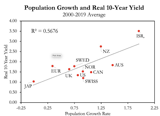
I was recently embroiled in a debate over what determines the path of real interest rates.  The debate was whether the standard desired saving - desired investment (S-I) theory of interest rates or the liquidity preference theory best explains the path of real interest rates. The former looks to the fundamentals of time preferences, population growth, and expected economic growth as the explanation for real interest rates. The latter view looks to money markets and the expected interest rate path of the central bank as the explanation. My take has been the fundamentals view is more important over the longrun while the money view is more important in the shortrun. 

Here are some charts I made that look at the longrun and show that fundamentals are, indeed, tied to real interest rate formation in advanced economies. Specifically, population growth rates and fertility rates are associated with the 10-year real yield.  I created these charts  after chatting with Matt Yglesias about his book "One Billion Americans" for the podcast. He verbally sketched out these scatterplots and I was curious to see if they held up in the data. They did! 


FOMC Humor
Finally, here is my attempt at the two choice meme as it relates to Treasury Secretary Mnuchin's decision to pull back the Treasury backstop funds for the Fed's 13(3) facilities. I joked that maybe the Secretary was attempting to force Congress to be more active on relief and rely less on the Fed. Looks like I was not too far off. Anyways, the tension between asking the Fed to do more with 13(3) facilities and asking Congress to do more is real. 


Wednesday, September 2, 2020

The Fed's New Framework

I have a new article presenting my take on the Fed's new average inflation target (AIT). It includes an explanation of how it works compared to the Fed's previous inflation target and what it could mean for the recovery. I note that although AIT it is not quite a NGDP level target, it is a step in that direction. Moreover, it could lead other central banks to follow suit. Check it out.

Also, here is an earlier piece I wrote on make-up policy and how it could be best implemented via a NGDP level target. It was published before the big announcement last week.

Finally, here is St. Louis Fed President Jim Bullard's take on AIT. He explains how this new framework gets us fairly close to NGDP level targeting. 

Monday, August 10, 2020

Monday, July 6, 2020

Make-Up Policy: Where Art Thou?

As we head into the second half of the year, the swift recovery many were hoping for is facing an uncertain future. The resurgence of the COVID-19 virus and concerns about dwindling fiscal support have many worried. I submit that even in the absence of these worries, the recovery would still be on shaky grounds without the Fed explicitly committing to 'make-up' policy. 

Make-up policy is an explicit framework that allows the Fed to correct for past misses in its target. In the case of a recession, this feature allows the FOMC to be fine with inflation temporarily overshooting its target while the economy bounces back. Tolerating this overshoot implies a similar surge in nominal income that would restore it to the levels expected by household and business prior to the crisis. This restoration is important since many fixed-price nominal financial obligations like mortgages, loans, and leases were made based on these forecasts of nominal income.  

Without make-up policy, the Fed may feel uncomfortable with inflation temporarily overshooting and prematurely tighten monetary policy. This would prevent nominal income from returning to its pre-crisis trend levels and trigger secondary spillover effects like mass insolvencies and other financial stress. 

Chris Condon notes that the Fed is aware of this issue and has been discussing it at the FOMC meetings this year.  For all this talk, though, members of the FOMC have given no indication in the Summary of Economic Projections (SEP) that they are taking make-up policy seriously. The SEP indicates persistent undershooting of its inflation target and consequently, a lack of make-up policy in its implicit nominal income forecasts. 

Nominal income or NGDP can be constructed from Table 1 in the SEP by combining the real GDP growth forecasts with the PCE inflation forecast plus 20 basis points (to make it GDP Deflator equivalent). This is done in a revised version of Table 1 below:


The second-to-the-last row of the table is titled "NGDP Change - 4.0" and is the forecasted NGDP growth rate minus the pre-crisis trend of 4 percent growth. The final row accumulates up these misses and reveals NGDP is still 5.3 percent below its per-crisis path even after 2022. Put differently, there is a permanent loss in nominal income according to the SEP. 

These forecasts are applied to the current NGDP levels to create a forecast in dollar level form and are presented in the figure below. The sustained drop in nominal income can be seen as the difference between the pre-crisis trend and the forecasted level of NGDP:


Note, that this forecasted loss is based on FOMC members assessing what is "appropriate monetary policy" for the SEP. The FOMC, in short, currently does not see make-up policy in the cards nor does it see it as appropriate monetary policy. Similar implications fall out of other Federal Reserve forecasts, including this one from the New York Fed. 

But it not just the Fed who thinks there will be no make-up policy and therefore a sustained loss in nominal income. First, the CBO's July update  shows a persistent gap between nominal income and its pre-crisis trend over the next decade. This forecast is conditioned on, among other things, what the CBO sees as likely monetary policy going forward.  


Second, the Blue Chip consensus forecasts of NGDP also shows a sustained drop in nominal income. The graph below shows this drop and compares it to the neutral level of NGDP, the level of nominal income needed to meet the expectations of households and businesses plans in years leading up to the crisis. The forecasted gap between these two measures is called the NGDP Gap


So wherever one looks, make-up policy is not being forecasted. Its absence does not bode well for the recovery and underscores the urgency of the FOMC review of its framework. I really dread repeating the slow recovery of the last decade. So please FOMC, bring this review to a vote and give make-up policy a chance during this crisis. 

Update: A reader informed me that adding 20 bps to the PCE inflation to make it equivalent to GDP deflator inflation may overstate the difference. If so, the analysis above actually understates the permanent loss in nominal income projected by the FOMC's SEP.

Wednesday, June 24, 2020

NGDP Targeting in the United Kingdom

Something interesting is happening in the United Kingdom. Some government officials there are pushing for the Bank of England to adopt an NGDP target. From the Independent:
Officials in the UK Treasury are “probably” considering whether to change the Bank of England’s inflation-targeting mandate due to the massive economic shock imparted by the coronavirus crisis, according to a former minister.
 Lord Jim O’Neill, who was commercial secretary to the Treasury in 2015, wants the central bank to shift from its current target of keeping inflation at 2 per cent to targeting a steadily rising trend of nominal UK GDP growth instead.
Since the U.K. Treasury determines the monetary policy target for the Bank of England, these rumblings are more than noiseThe U.K. Treasury's increased interest in an NGDP target is driven, in part, by the efforts of Jim O'Neil. He has written articlesdone interviews, and made a forceful case for this approach to monetary policy. Another prominent voice is Sajid Javid who was recently the Chancellor of the Exchequer. He also has called for NGDP targeting in a new study. They are not alone, as other members of Parliament also talking about an NGDP target and several UK think tanks are promoting it as well. There seems to be, in short, some real momentum for NGDP targeting in the Boris Johnson government.

If the Bank of England were to get an NGDP target, it would be the first central bank to explicitly do so. The Bank of England was an early adopter of inflation targeting, so it would be fitting for it also to be an early adopter of NGDP targeting. Moreover, moving to this monetary policy framework should not be too hard for the British central bank since it already does something that looks a lot like an NGDP target.

Still, this would be seen as a big change for the central bank and many observers are unsettled by its prospects. Again, from the Independent
Lord O’Neill conceded that the idea of moving to nominal GDP targeting would  “scare” many people in the Treasury and the Bank who regard the current inflation-targeting regime as a proven success.
To those observers who are worried, I would encourage you to check out my paper from late last year that summarizes the facts and fears of NGDP targeting. It was written with the Fed in mind, but its lessons are applicable to any central bank. Here, I want to make three points that are specifically directed toward the Bank of England adopting an NGDP target.   

Changes in Potential Real GDP: Much Ado About Nothing
My first point is that changes in potential real GDP should not be a practical concern if the Bank of England were to adopt an NGDP target. Changes to potential real GDP is a common objection to NGDP targeting and in principle a legitimate concern. In practice, however, the magnitudes involved make this a moot concern. 

To illustrate this point, imagine that the Bank of England had been credibly targeting NGDP at 4% a year since the mid-1960s. Also assume that the potential real GDP (y*) evolved as it actually did over this period. The difference between this imagined NGDP target and the actual growth rate of y*, would be the counterfactual trend inflation experienced during this time. The figure below shows the outcome. It reveals that trend inflation in the UK would have ranged from about 1% to 3%. The average inflation rate over the whole period would have been just under 2%. Not a lot to see here. Even if we tweaked the NGDP target up a bit, there would still no runaway inflation. Instead, we end up in a world with longrun inflation well-anchored and a stable growth path for nominal income. 


Now to the extent that changes in potential real GDP do matter, it actually favors NGDP targeting over flexible inflation targeting (FIT). Josh Hendrickson and I show this outcome in a JMCB paper (ungated version) last year. The punchline is that a central bank doing FIT needs to know both potential real GDP (y*) and real GDP (y) in realtime to avoid making mistakes. A central bank doing NGDP targeting does not need to know y* or y in realtime. In fact, it intentionally remains agnostic about them over the shortrun and simply aims to stabilize nominal income. As a result, it is less likely to accidentally make matters worse. This is not just a theoretical argument. Athanasios Orphanides, for example, shows that one reason for the Fed's tepid response to rising inflation in the in the 1970s was bad realtime data on the output gap. In more recent times, one see the Fed's talking up of rate hikes in the fist half of 2008 or the ECB's outright tightening of policy in 2008 and 2011 as manifestations of this problem. 

Concerns about changes in potential real GDP, then, are much ado about nothing under an NGDP target and only meaningfully matter for a FIT. 

NGDP Targeting Would Not Be a Radical Change 
My second point is that the Bank of England adopting an NGDP target would not be a radical change. For it is already producing outcomes that closely mimic an NGDP target. This can be seen in the figure below.

This chart shows that prior to the COVID-19 crisis, the Bank of England had grown NGDP about 4% a year along a stable path. This is exactly what an NGDP level target would look like. Interestingly, former Governor Mark Carney actually wanted the Bank of England to follow an NGDP target when he first arrived. The idea was quickly shot down, but nonetheless he got the outcome he was calling for back in 2012. It is almost as if the Bank of England had a stealth NGDP target under his stewardship. 


Prior to the Great Recession, NGDP was also on a relatively stable path, though during this time it was growing closer to 5%. This too looks similar to an NGDP level target. Both of these NGDP targeting-like experiences, however, end in a sustained trend path drop that is not made up. In other words, the Bank of England's implicit NGDP target is actually a version of a growth rate target rather than a level target. And that is where the recent calls for an NGDP level target are different from what the central bank has been doing.

The Real Change Would Be an Explicit Make-Up Policy
My final point is that the real change being called for is the adoption of a level target. That is, the goal is to move the Bank of England from an implicit NGDP growth rate target to an explicit NGDP level target. This would require the central bank to make up for past misses from its target. Put differently, an NGDP level target would empower the central bank to temporarily run the economy hot until NGDP got back up to its trend growth path. In the case of the United Kingdom, that means growing NGDP faster than the trend 4% growth rate. This faster-than-normal catch-up growth is sometimes called 'make-up' policy and is illustrated below: 


What an NGDP Level Target Might Look Like in the United Kingdom
If the UK Treasury were to announce an NGDP level target for the Bank of England, it could be as simple as restoring NGDP to its trend growth path that existed under Mark Carney. That is, temporarily run NGDP hot to make up for shortfalls below its trend path that occurred during the COVID-19 crisis. After that, simply grow NGDP at 4%. As seen in the first figure, a 4% level target would probably be fine given likely changes in potential real GDP in the United Kingdom. More complicated versions of an NGDP level target are possible, but I would start simple.

In closing, it is worth noting that NGDP targeting is not a new idea. It was highly talked about in the 1980s, but gave way to inflation targeting in the 1990s. The United Kingdom's adoption of an NGDP level target would simply put monetary policy in advanced economies back on its original journey. Bon voyage to the Bank of England!

Related Links

Thursday, June 11, 2020

The Public Finance Implications of COVID-19

Peter Stella joined me on the podcast this week. He was back by popular demand and we touched on two important and related questions: how should the government finance its relief efforts and who should ultimately manage the public debt? The U.S. Treasury may seem like the obvious answer to both questions, but it is not the whole story. The Federal Reserve can also finance the relief efforts and, in so doing, affect the structure of public debt. But is this a good thing? 

Peter Stella says no, at least in the longrun. He makes the case that it is economically and politically cheaper to return the financing and management of the public debt back to the U.S. Treasury once the COVID-19 recession is over. In other words, the Fed's expansion of its balance sheet, an understandable response to the crisis, needs to be unwound as the economy improves. Otherwise, we might end up with two government agencies with very different objectives trying to manage the public debt. 

This is an interesting argument and one I want to flesh out in this post by taking a closer look at the two questions of financing the budget deficits and managing the public debt.

Financing the Budget Deficits
The first issue is financing the budget deficit. The question here is whether the government should fund the deficit through (1) overnight debt with a variable interest rate or (2) long-term debt with a fixed interest rate. The former option is what happens when Federal Reserve liabilities--the monetary base--finance the deficit, while the latter option arises when it is funded by treasury securities. 

The Fed financing of deficits, in other words, is not risk free. It could lead to higher financing costs as the economy recovers. In such a scenario, financing with long-term treasury securities with fixed interest rates would be ultimately cheaper. But is this even possible in the current crisis with the Fed buying up so much public debt? That is, even if Treasury Secretary Steve Mnuchin issued more long-term treasury bonds, the Fed's asset purchases have been so large they would effectively convert most of the long-term bonds into overnight reserves. 


That, in fact, is what has happened over the past three months. The chart above shows that for  March, April, and May, the Fed purchased about $1.67 trillion of treasury securities compared to $2.31 in new issuance. The Fed, in other words, bought up about 72 percent of the treasury securities supplied during this time.

Not only was the Fed buying up most of the new issuance, but it was buying up treasury securities with a maturity far longer than overnight reserves. This can be seen in the chart below. The Fed, then, has been acting as the final financier for most of the deficit during the COVID-19 crisis and, in so doing, has transformed the structure of $1.67 trillion of U.S. public debt into overnight government liabilities.


Managing the Public Debt
So are we stuck with these short-term government liabilities forever? As Peter Stella explained in the show, the answer is no. The U.S. government could convert those overnight reserves back into longer-term treasury securities once the crisis is over.  

To illustrate how, imagine that by the end of 2020 the Fed has bought up $2 trillion in treasury securities. The purchase of these treasuries were used to indirectly fund the cash transfers to households, the PPP program, extended unemployment benefits, and other economic relief efforts. The figure below shows this development in terms of the respective balance sheets of the Treasury and Fed. The treasury securities are liabilities for the U.S. Treasury and assets for the Fed and vice-versa for Fed-issued reserves. The Treasury takes the reserves on its balance sheet and sends them to the private sector as part of the economic relief efforts.


If we now combine the Treasury and Fed balance sheets into a consolidated government account and also look at the private sector balance sheet, we see the following two t-accounts: 


The net government liabilities are now $2 trillion in overnight reserves which are assets on the private sector's balance sheet. Again, during a crisis this is not a surprising outcome as the Fed rapidly expands its balance sheet. But left unchanged, it would imply rising interest rate costs once the economy starts recovering and the Fed is forced to raised the IOER to keep inflation in check.

To avoid this problem, Peter Stella recommends that after the crisis the Treasury issues additional long-term treasury bonds that lock in low interest rates. Selling these treasuries to the private sector means taking reserves off their balance sheets. The Treasury, in other words, is swapping long-term treasury securities for the overnight Fed liabilities. This is what the consolidated balance sheet would like after this activity: 


Peter Stella outlines this process more thoroughly in his paper titled "Exiting Well". Again, this would not happen right away, but after the crisis has ended. 

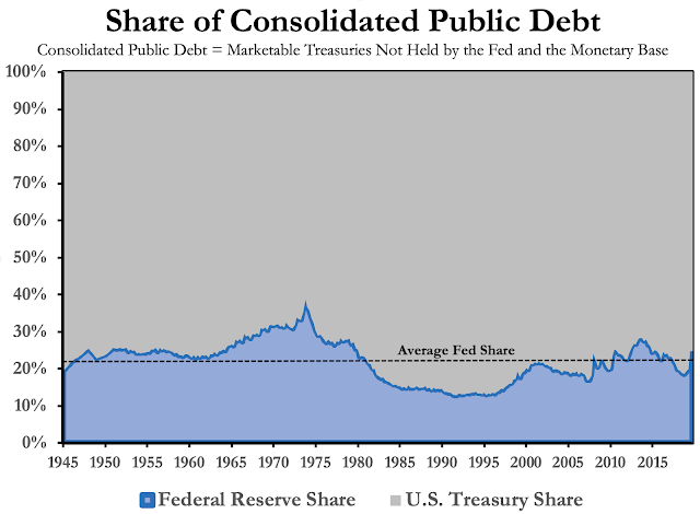
Historically, the Fed has financed about 20 percent of the consolidated public debt (CPD) based on data back through 1945. I define CPD as the sum of marketable treasury securities not held by the Fed and the monetary base. Using data from the Financial Accounts of the United States, I constructed the chart below that shows the share of CPD attributable to the Fed and the U.S. Treasury. 

Unsurprisingly, the Fed's share of CPD during the Great Inflation rose to an average of almost 30 percent and hit almost 40 percent in 1974. During the Great Moderation it fell to about 14 percent. As of May, the Fed's share of CPD is approximately 24 percent, just above the historical average. The reason it is not higher is because of large budget deficits coming into the crisis. 


If 'exiting well' means returning to the historical average, it might occur naturally with regular budget deficits after the crisis. If 'exiting well' means returning to something closer to the Great Moderation levels, then this will be a more ambitious project and require a vast reduction in the stock of reserves.

Other Considerations
The argument so far for reducing the Fed's management of the public debt is that it is likely to be economically cheaper. As noted by folks like George Selgin, Charles Plosser, Paul Tucker, and others, a second argument is that it is also politically cheaper for the Fed to avoid playing the role of public debt manager. The management of U.S. public debt is normally under the purview of the U.S. Treasury because this process is inherently politically and therefore overseen by representatives of the taxpayers. The Fed can avoid these political entanglements by minimizing its influence on public debt management. This, of course, requires a smaller Fed balance sheet.

A post-crisis journey to a smaller balance sheet, however, faces two big roadblocks. First, the Fed has chosen an 'ample reserve' or floor operating system. This keeps the stock of excess reserves large in normal times and therefore keeps elevated the Fed's influence over public debt management. A number of post-2008 bank regulations also has increased the demand for bank reserves. Some of these regulations have been tweaked in the crisis, but both they and the Fed's floor system would have to be reconsidered if we wanted to return to a world of scarce reserves and less political entanglement for the Fed. 

Finally, it is worth noting that maintaining large central bank balance sheets do not guarantee robust growth. The charts below show the 2009-2019 averages of central bank balance sheets sizes against several measures of nominal economic activity. They, ironically, show bigger balance sheets are tied to slower nominal growth. Now, it could be the case that the countries with the weakest nominal growth responded with the most aggressive use of the LSAP programs. This is probably true, but the data span an entire decade so one would expect to see inflation, domestic demand, and credit growth respond to the use of LSAPs over this long of a period if QE worked as advertised. If nothing else, these figures should give us pause in considering the benefits of maintaining large central bank balance sheets over long periods. Further analysis of this data supports this interpretation. 


So between the higher financing cost for the public debt, the greater political entanglement for the Fed, and the unclear benefits from maintaining a large central bank balance sheet over a long period, we should take seriously Peter Stella's suggestions for 'exiting well' once the crisis is over. Here's hoping we do.

Tuesday, May 26, 2020

Extensions to the NGDP Gap

The monetary policy program at the Mercatus Center recently released a new measure called the NGDP gap. We created it as an alternative way to gauge the stance of monetary policy and have provided a website that will update the measure as new data become available. In this post, I will briefly summarize the NGDP Gap and then highlight a few extensions that some readers may find useful. 

Summary of the NGDP Gap 
As mentioned above, the NGDP Gap provides a cross check on the stance of monetary policy. Its use does not require the Fed to adopt a NGDP target, but it does draw upon the fact that NGDP is comprised of both real GDP and the price level and therefore captures both elements of the Fed’s dual mandate. Moreover, since NGDP is a nominal variable it can be shaped by the Fed over the medium to long run. 

The basic idea behind this measure is to construct a benchmark growth path for nominal GDP (NGDP) where monetary policy is neither expansionary nor contractionary. Deviations of actual NGDP from this neutral level of NGDP provide a way to assess the stance of monetary policy. These deviations, in percent form, are called the NGDP gap. 

The NGDP gap can also be called the nominal income gap since NGDP equals NGDI. In fact, the construction of the neutral level of NGDP can be most easily understood from a nominal income perspective. To see this, consider that people make many economic decisions based on forecasts of their nominal incomes. Examples include households’ decisions to take out mortgages and car loans or firms’ decisions to finance with debt and commit to multiyear contracts on plants, raw materials, and labor. Sometimes, however, actual nominal incomes may turn out very different from what people expected and, as a result, may be disruptive for households and firms that are not able to quickly adjust their economic plans. These disruptions can be minimized by maintaining nominal income on the growth path expected by the public.

The neutral level of NGDP, then, is the public’s expected growth path of nominal income. Both this measure and the NGP Gap are shown below up through 2020:Q1 and come from a NGDP Fact Sheet we will be publishing each quarter. 


To be clear, non-zero NGDP gap outcomes need not be the result of Fed policy but of monetary conditions more generally. For example, the current NGDP gap exists because of the severe nominal income shortfall that has emerged from the COVID-19 shock. Consequently, the job of the Fed and U.S. Treasury during this crisis is to close this gap and avoid the secondary spillover effects (e.g. mass insolvency) this shortfall could create. Failure to close it would indicate a failure of countercyclical policy. This measure, then, provides a useful guide for the economic relief efforts during the pandemic. 


Extension I: Blue Chip Forecast Version
A key goal of this project was to provide a measure that is relatively simple to calculate and uses publicly available data. To that end, the neutral level of NGDP is based off of forecasts from the Philadelphia Fed's Survey of Professional Forecasters (SPF) and BEA data on NGDP. There is no use of r-star or u-star and therefore no "navigating by the stars" in this measure. The neutral level of NGDP is just an averaging of NGDP level forecasts from accessible data sources. Below is the formula for the neutral level of NGDP:

where NGDPt* is the neutral level and NGDPt-iSPF forecast(t) are NGDP level forecasts for period t coming from the past 20 quarters. NGDPt*, in short, is just a rolling average of NGDP level forecasts for a particular period. The difference between it and actual NGDP is the NGDP gap. 

Given the five-year (20 quarter) window in creating NGDPt*, there is a need for long-term NGDP forecasts. They are available in the SPF, but begin only in 1992 and therefore limit our series to a start date of 1997. 

The Blue Chip forecast database provides a long-term NGDP forecast that goes back further than the SPF. Alexander Schibuola and Andrew Martinez (2020) use it to construct an even longer time series of the NGDP gap. It is shown in the figure below along with the SPF version we use at Mercatus. The two NGDP gaps are very similar. 


Interestingly, Schibuola and Martinez use the data to construct a forecasted NGDP gap and it is disturbingly large. Even the recovery looks nasty. 

The use of Blue Chip data is a nice extension of the NGDP gap. However, we still plan to use the SPF version as our baseline version since the data is free and we can show the underlying calculations to the public. Eventually, we plan to provide the Blue Chip version as a complement to our baseline SPF version, but since it uses proprietary data only the final measure will be available. 

Extension II: Precision Version
Schibuola and Martinez also provide another useful extension of the NGDP gap that looks at its precision. They motivate this by noting two potential issues: (1) the forecasters in the SPF sample change over time and (2) individual forecasts in the SPF may be very different. Accounting for these two issues they produce the following chart that shows the range of individual forecasts for a semi-fixed sample of forecasters in the SPF. 


The median of the semi-fixed sample provides a very similar result to the overall median of all the forecasters. Also, the range of forecasts provides a way to better think about the stance of monetary policy. For example, one could make the case that monetary policy was neutral in 2019 since the range of estimates span both sides of 0 percent. 

Extension III: NGDP Targeting Application
As noted above, the use of the NGDP gap does not require the adoption of a NGDP target by the Fed. Nonetheless, a closer look at the forecasts used in constructing the neutral level of NGDP reveal that it could be used by the Fed as the target growth path for a NGDP target. For it would amount to a NGDP level target that slowly changes the target NGDP growth path based on changes to forecasts of potential real GDP.


To see why this is the case, note that we use a combination of short-run and long-run forecasts of NGDP to construct the neutral level estimate of NGDP. The SPF provides distinct quarterly NGDP forecasts for five quarters out: t+1 to t+5. After that, we use the average annual NGDP forecast over the next 10 years adjusted to a quarterly basis for quarters t+6 to t+20. This is seen in the table below. 


What this means is that three-fourths of each NGDP neutral level estimate is being shaped by a long-term forecast of NGDP. This long-term forecast, in turn, is the sum of a 10-year average GDP deflator inflation forecast and a 10-year average real GDP growth rate forecast. The long-term inflation forecast is determined by the Fed's inflation target while the long-term real GDP growth rate forecast is shaped by expected changes in the potential real GDP growth rate. 

Consequently, as the neutral level of NGDP series moves through time, it can be seen as a rolling average of expected changes to potential real GDP growth plus the Fed's inflation target. This is the kind of NGDP level target some advocates, like Jeff Frankel, would like to see implemented.  

The figure below shows the neutral level of NGDP constructed with the Blue Chip data, complements of Schibuola and Martinez. This version allows us to see a hypothetical NGDP level target from late 1987 to present based on the neutral level measure of NGDP. 


Again, the original intent of the neutral level of NGDP and the NGDP gap is simply to provide a crosscheck against other measures of the stance of monetary policy. The discussion of a NGDP level target is simply an extension of this work. 

Here's hoping, though, that the Fed and Treasury keep this measure front and central in their efforts to provide economic relief during the COVID-19 crisis.